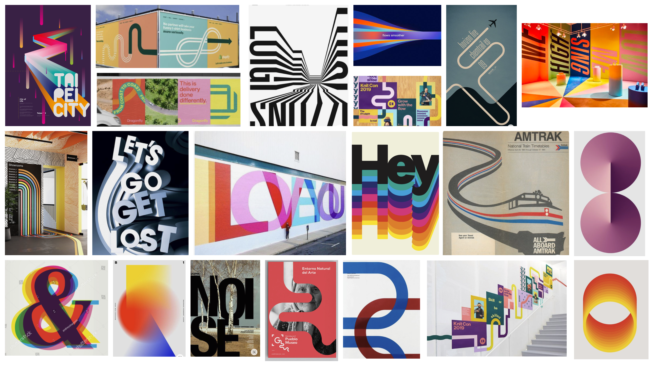
Armed with an initial product release list and a theme of “better together” we started gathering campaign inspiration into concept mood boards. Looking for ideas on how we could creatively convey the idea of connection and coming together. Two strong concepts came out of this exercise. The idea of blending brand colors together really resonated with the team. I began exploring ways we could extend this approach to the digital surfaces.
We faced an aggressive deadline, requiring all assets to be designed, built, and handed off to the localization team with enough lead time for global translations.
I had to master the internal web platform's limitations, ensuring that all creative assets were compatible and could be executed flawlessly within the system’s constraints.
The project was complicated by last-minute changes and missing product screens, requiring adaptability and rapid iteration to ensure the final assets were accurate and up-to-date.
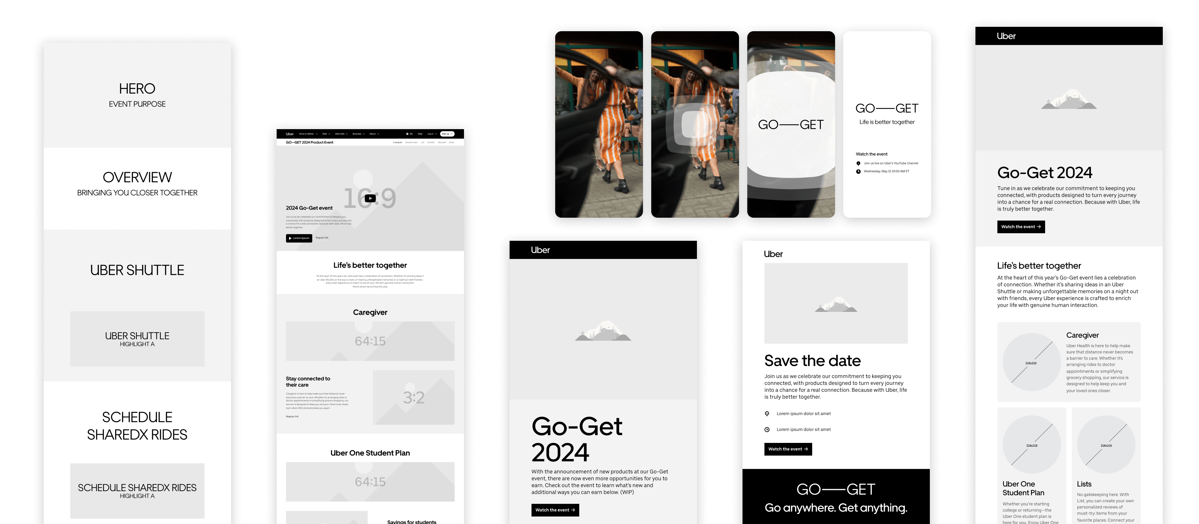
Developing content stacks, wireframes, and storyboards for each deliverable was essential in clearly conveying hierarchy, layout structure, and narrative flow. These tools not only facilitated stakeholder approvals but also provided the team with a visual framework to accurately scope and plan their efforts, ensuring alignment and efficiency throughout this fast-moving project.
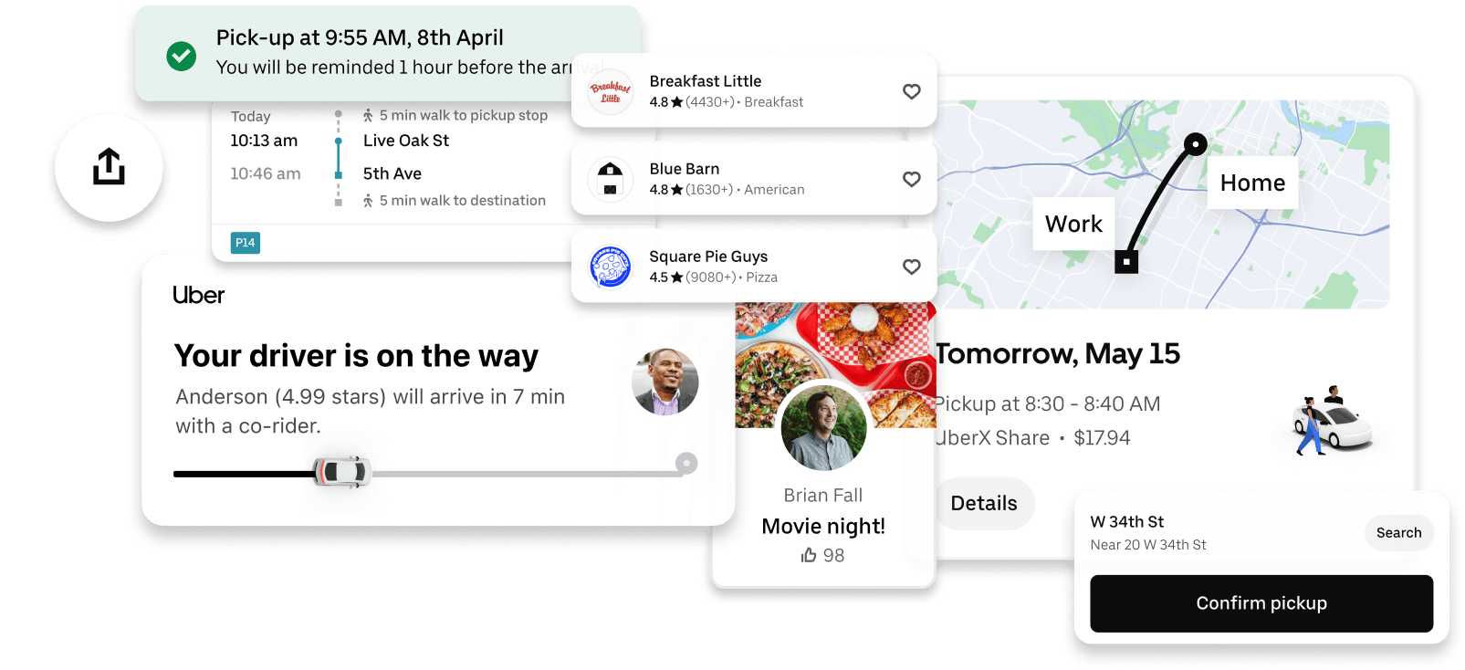
I looked through hundreds of UI screens and narrowed in on a handful of selected views that communicated the new app features. I took specific sections and simplifying them down to key elements, which communicated the new product features and set myself up for successful language translations.
Initially, all the assets where created in English. As this was a global campaign, I was mindful of line lengths and character counts because they were being translated into seven additional key languages. Working closely with Uber’s translation team, I managed over 200 additional assets for the website plus translated assets for email and social media.
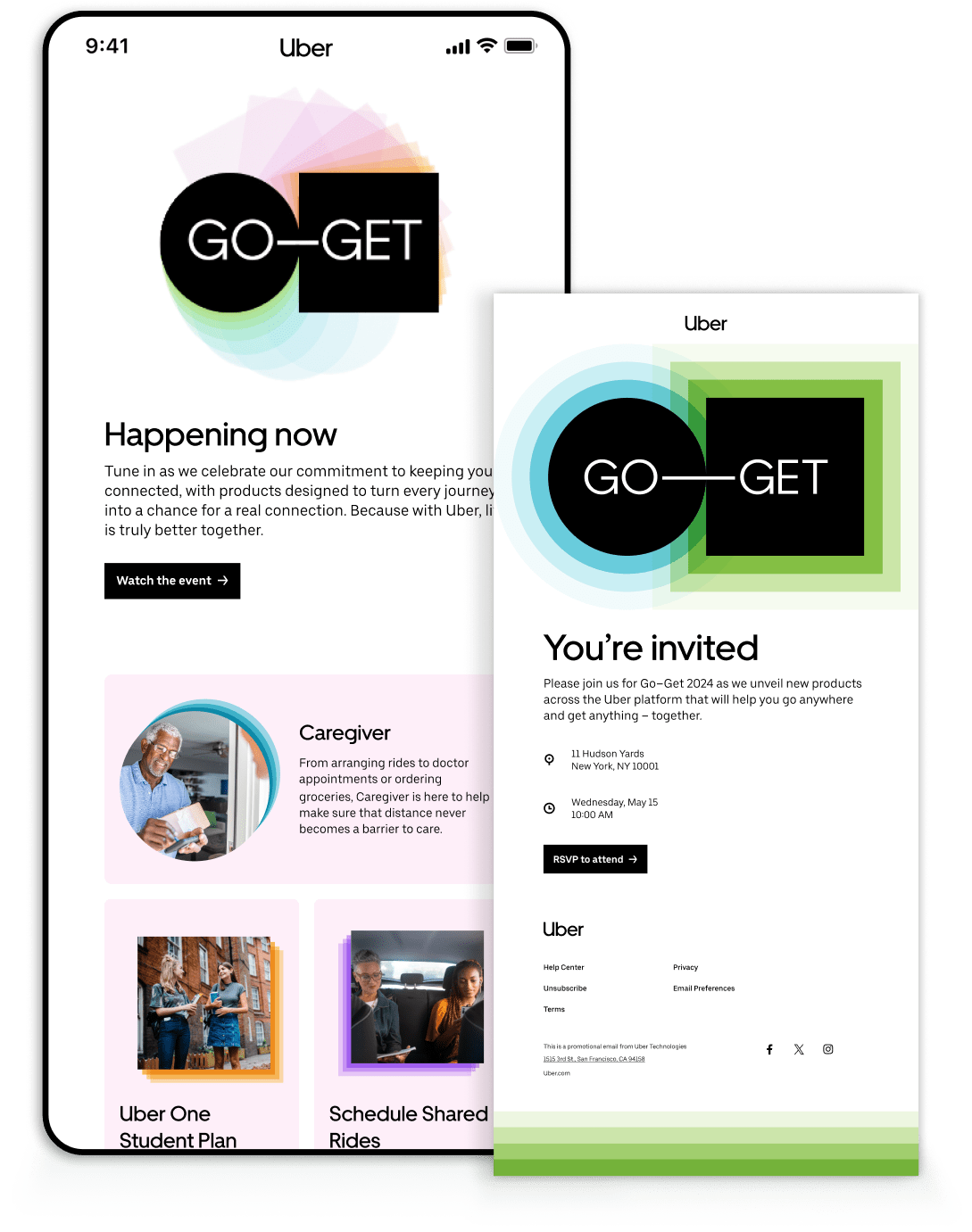
I created a series of emails for all phases of the campaign. Including event invites to journalists and tech influencers. For the general public, event teasers urged people to tune into the live stream. Afterwards, a post-show recap email of the products and features released pulled everything together.
Utilizing the visual identity of trailing and blending colors, I created detailed storyboards for social media posts. Our animator brought these designs to life connecting them to the other assets in the campaign.
Over the 2023 event digital content.
An increase of 102% year over year.
Attended the live event in New York.