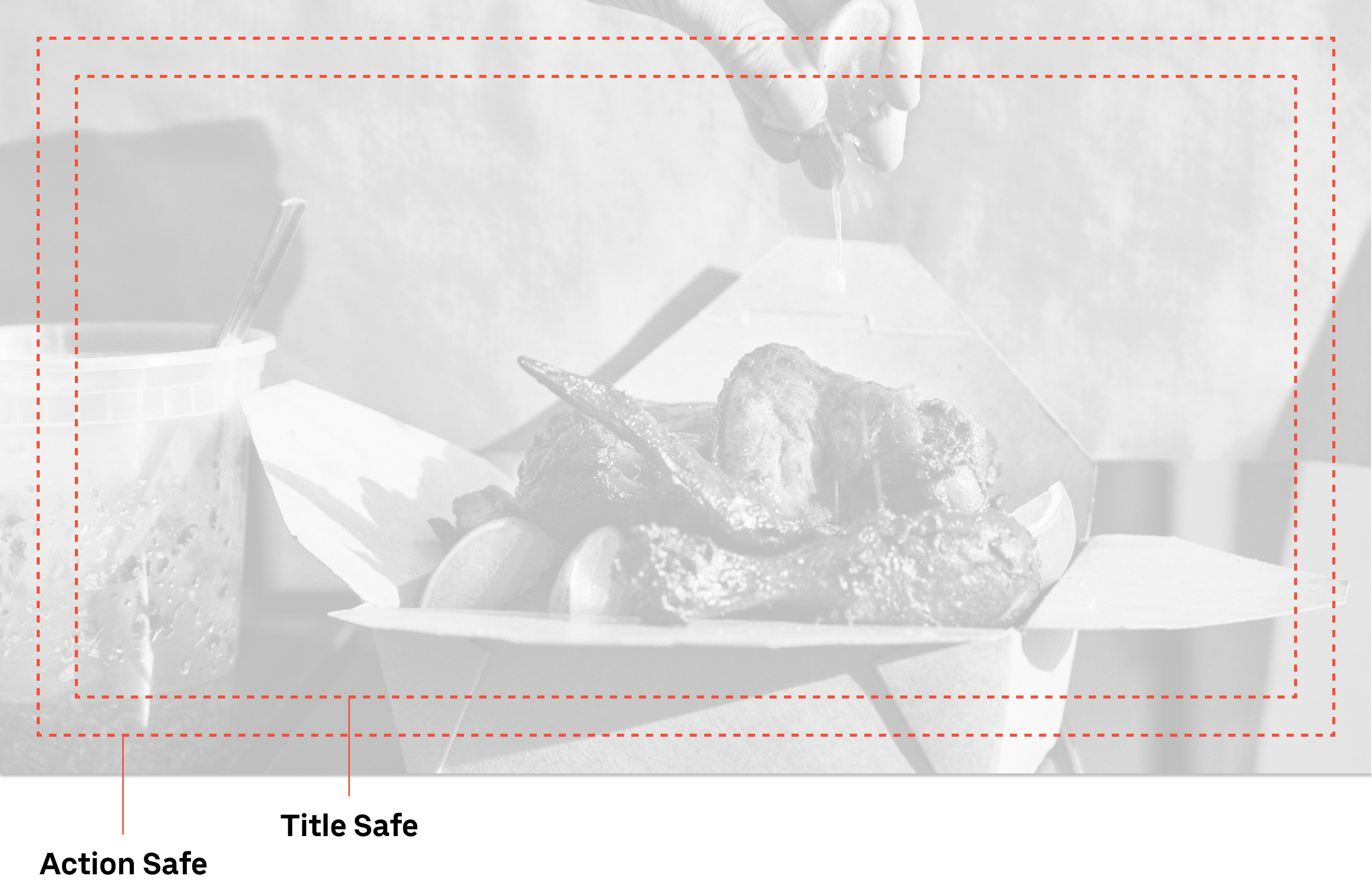
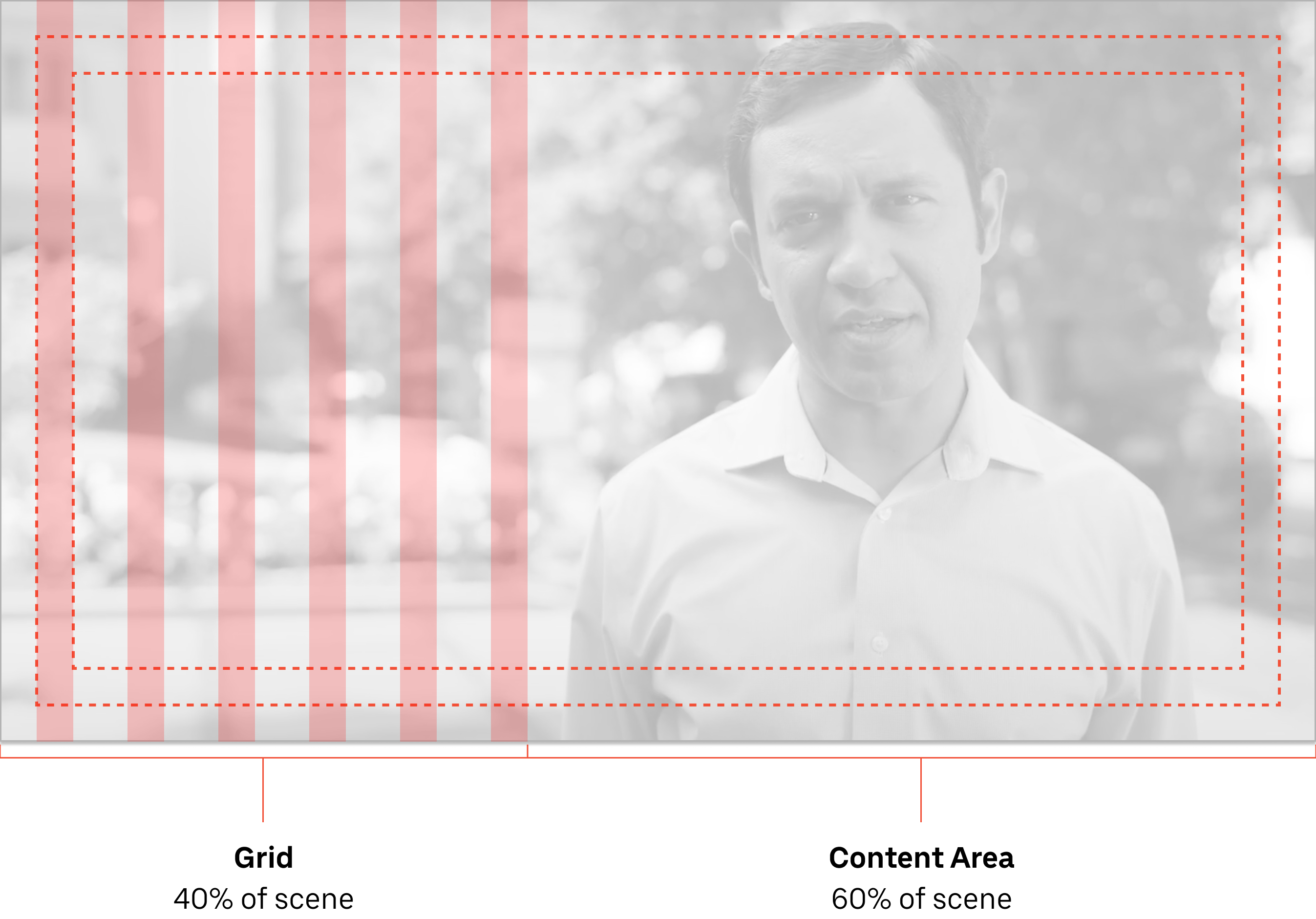
Product UI in motion

As Uber’s product UI became increasingly integrated into brand films and marketing campaigns, it began serving a critical bridge between product experience and brand storytelling. However, the absence of a shared visual and motion language led to inconsistent representations of the product across campaigns, reducing clarity, weakening brand cohesion, and creating repeated production effort across internal teams and agency partners.

The opportunity was to establish a scalable framework that aligned cinematic storytelling with accurate product representation, enabling teams to use product UI consistently while maintaining creative flexibility. I led the development of a unified set of guidelines and motion principles that standardized how product interfaces were visualized and animated, creating a shared foundation used across campaigns to improve consistency, production efficiency, and brand integrity.

Responsibilities

Art Direction, UX and Copywriting

Client

Uber

Established

A consistent visual language

Created

A scalable foundation

Aligned

Product UI with brand storytelling

Developing a framework

Approach

I conducted an audit of existing campaign work alongside the live Uber applications to identify recurring interaction patterns and inconsistencies. From this, I defined a core set of UI behaviors and motion principles that established how interface elements should support narrative without competing with it.

Placement guidelines

Establishing clear guardrails for placement and UI visual weight was crucial to maintaining visual consistency across the composition. This foundation ensured a cohesive on-screen experience, reinforcing brand identity and enhancing overall design clarity.

Safe area

On screen positioning of UI follows standard film safe areas of Action Safe and Title Safe margins. To aid comprehension of UI elements they are typically docked to the Title Safe area but can flex to the Action Safe area as space is required.

Safe Area
Grid

The story of the film should play the prominent role in the scene. So the content area is larger than the UI grid area. The UI is used to help support the overall story.

Grid

A toolkit of common UI transitions

Providing a flexible set of transitions for animating UI elements offers designers a comprehensive toolkit to begin their work. They can select the transition pattern that best fits the scene and effectively communicate their intention. Designers can utilize the toolkit files as a starting point to maintain consistency with easing and transition standards. This ensures the Uber UI is displayed as expected.

Slide in

One of the primary ways UI moves in the system is using the slit slide in transition, where content moves up behind a mask. This upward movement should feel fast and fluid.

Lists

The list selection animation is used to cycle through a short list of menu items. Items cycle into view rotating from either bottom-to-top or top-to-bottom. The active item increases in scale and opacity as it moves to the foreground. In the list, items always move vertically.

Fade in

UI elements can transition by fading in as the item slides into its final on-screen position. The opacity of the element UI can fade in from about 50% opacity to 90%, while sliding up and coming to rest. This transition may be useful for more complex UI elements where a single Slit transition is difficult to complete quickly.

Carousel

The carousel animation is used to cycle through a list of menu items. Items cycle into view from either the left or right side of the screen. With the active item increasing in scale and opacity as it moves to the foreground. In the carousel, items always move horizontally.

Alert iconFinal deliverable

I created a detailed webpage on Uber’s internal brand system website, that provided even more detail and specs about how to utilize the toolkit. This toolkit and starter files are used by internal teams as well as agency partners to ensure consistent animations. Those details were omitted here due to the company privacy policy.

Outcomes

Binoculars icon
Provided consistency

Established a unified approach to representing product UI across film and campaign work.

Chart icon
Created a scalable foundation

The framework was expanded upon in future campaigns.

Newspaper icon
Initiated broader conversations

Started conversations around simplifying UI representation across brand communications.