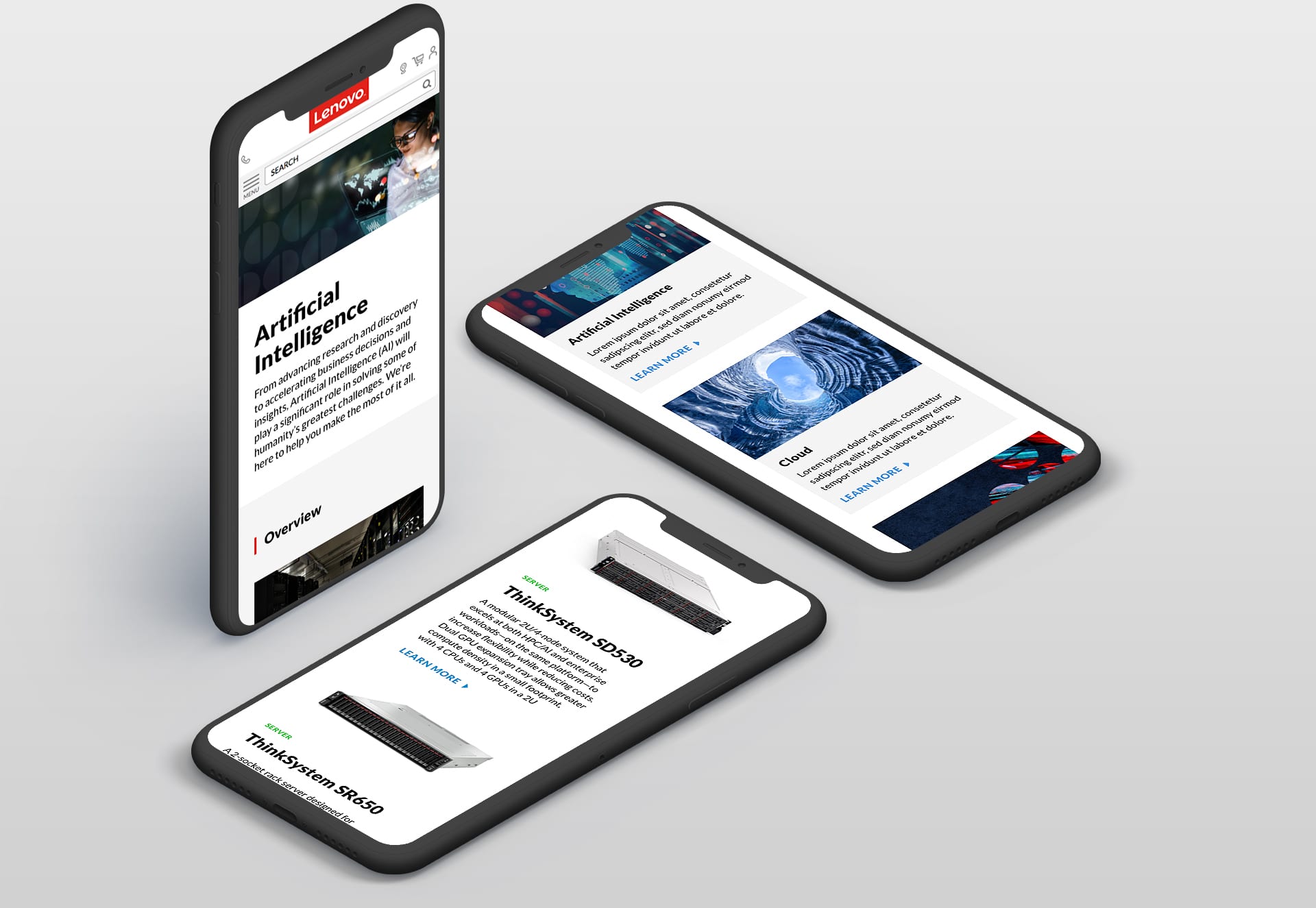
It was important to position Lenovo as a thought leader in the space. While creating a homepage that was a hub to drive users deeper into their offerings. Then building a consistent page structure for product offerings and surfacing relevant information.
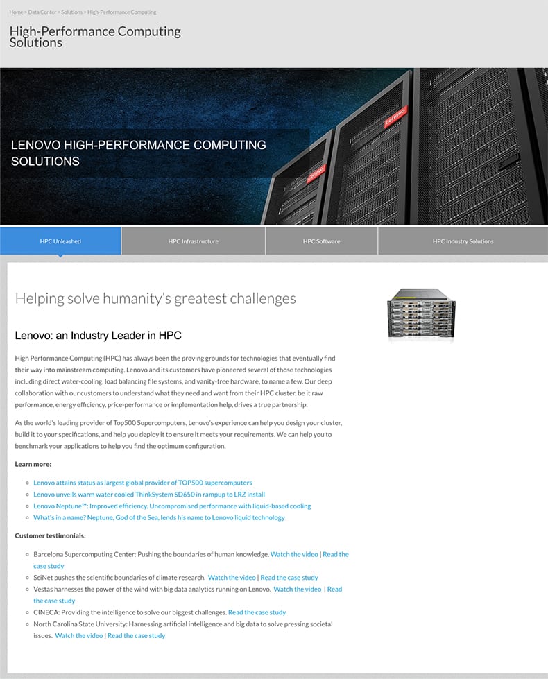
Pages were very copy heavy and didn't have a consistent tone. Product pages were not laid out in a similar format and it was hard to understand Lenovo's full product offerings from the homepage.
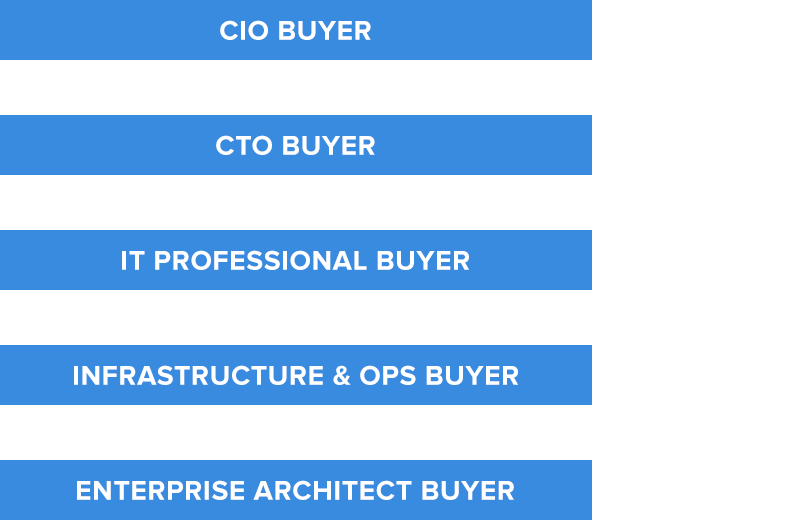
After speaking with the sales team, subject matter experts and reviewing site analytics. These were the key audiences that were targeted in the redesign. Taking into account their wants, needs and what influences their final purchase.
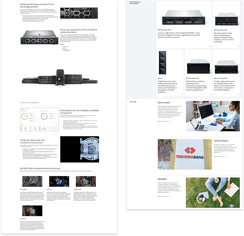
Looking at other big players in the space was important. It helped to explain the need for better product imagery and a consistent brand voice.
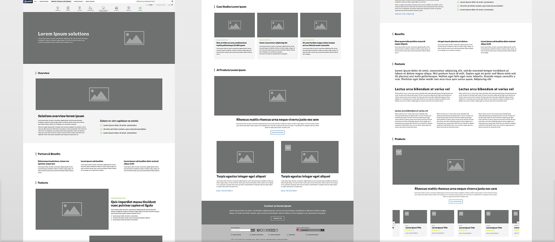
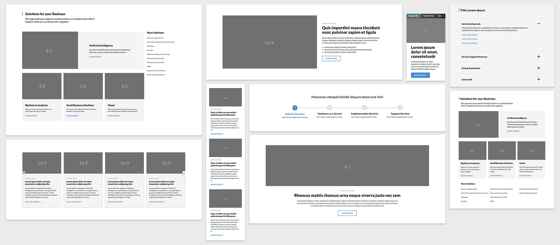
After taking into account the initial research. I created detailed wireframes that helped shape the page structure and inform the beginnings of the design system.
Starting at the atomic level, I considered how each individual element would blend together. This helped me create components that would form consistent page templates to ensure the entire site felt cohesive and worked together to tell the same visual story.
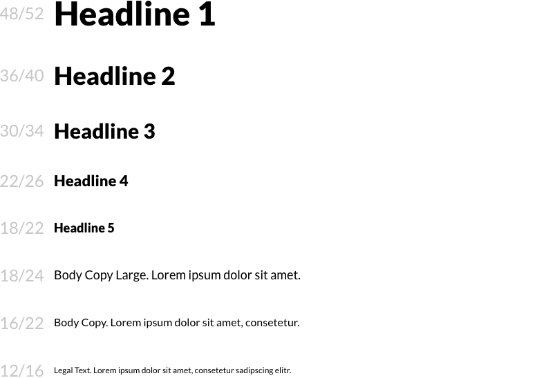
With typography, the most important factor was designing a scale that was flexible enough for punchy headlines, but that could also accommodate long product descriptions. Built to also account for localization into Lenovo’s many global markets, the typography is versatile enough to fit any language.
Flexibility was key with the button designs. I developed a purposeful mix of buttons to be used for large calls-to-action and also a set of icons that provided users subtle way-finding elements that allow them to organically discover content throughout the site, like articles, videos, resources, and 3D product renders.
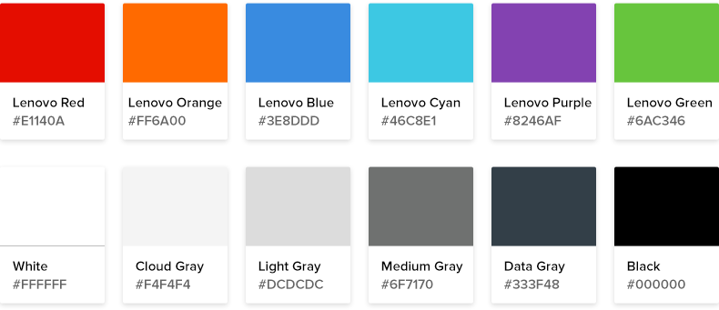
Taking Lenovo’s existing brand colors into account, I expanded upon their palette. I used an accessible and familiar set of colors that could be translated across touchpoints and used for background elements, textures, and accent colors.
To set Lenovo up for long-term success, I created a robust component library that is flexible enough to handle all of Lenovo’s existing content while also giving them room for growth as the business evolves.
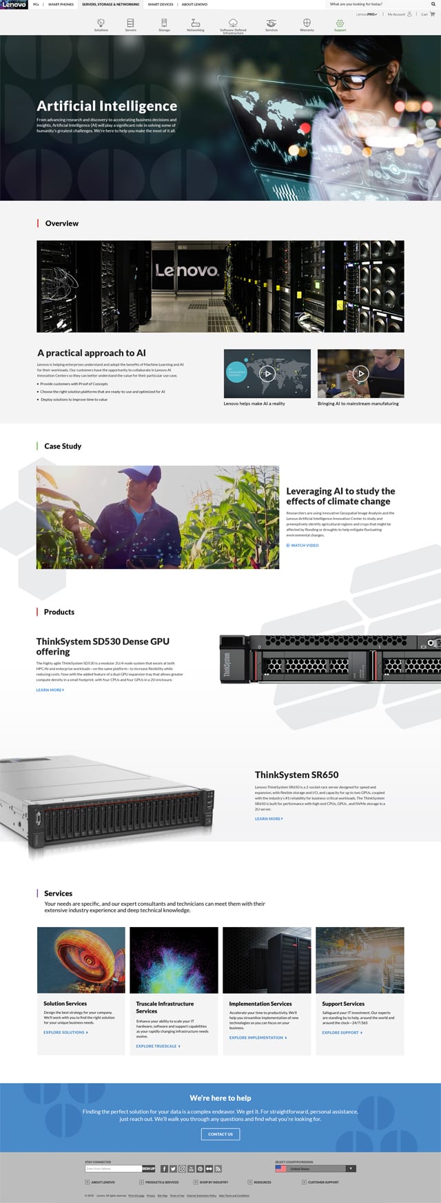
The template design was versatile enough to work across all of the 14 of solutions pages on Lenovo’s existing site. Made to accommodate simple pages, but also built to add branded textures, product carousels, and case study videos within the CMS, the pages are consistent but adaptable to the specific content on the page. This approach gives the pages visual consistency, but also showcases the differences between each product so the user can discover which is best for their business.
The entire design system is seamless across all devices, affording the user the opportunity to explore Lenovo’s full product offering, no matter where or how they are viewing the content.