left ArrowHome

CVEX Markets platform

CVEX is at the forefront of modernizing private market trading, leveraging cutting-edge technology and automation to redefine the landscape of private securities. By focusing on efficiency, transparency, fairness, and liquidity, CVEX is creating a new era of trading. At its core is the first-of-its-kind market, driven by an automated, scalable matching engine and platform, designed to seamlessly facilitate private securities transactions with unprecedented ease and accessibility.

Working closely with the CTO, Head of Product, and a small development team, I helped bring the platform to life by creating a design system with a distinctive dark mode interface, positioning CVEX as a standout in the financial marketplace.

Responsibilities

UX/UI and Product Design

Client

CVEX Markets

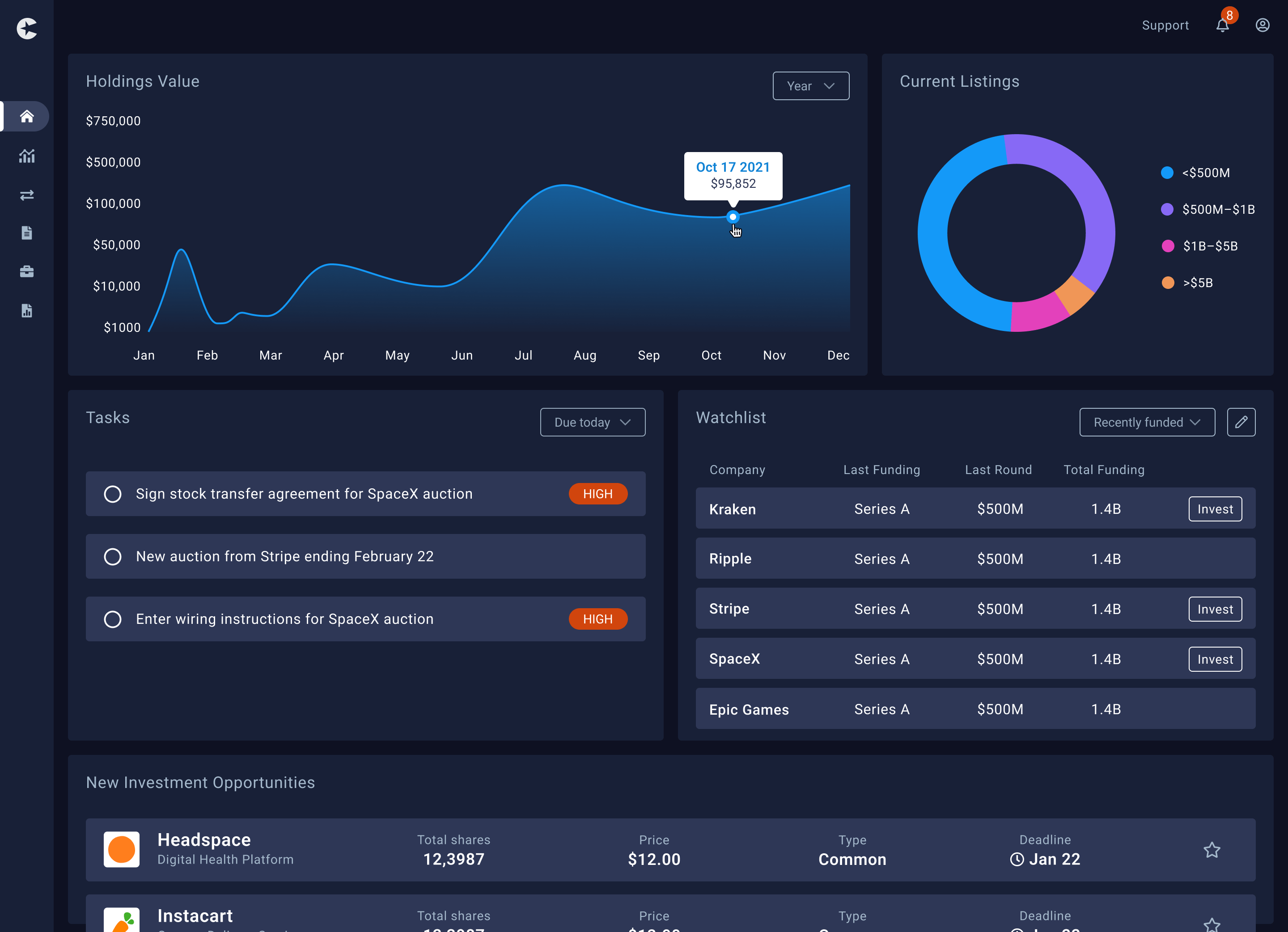
Cvex Dashboard

Challenges

Branding

The company lacked a clear color palette or any brand guidelines.

Regulatory requirements

These were difficult to complete and consumed a lot of company resources.

High level goals

01

Build a working dashboard that investors could get excited about to help secure future funding.

02

Have a platform with various active investment opportunities to start and grow the marketplace.

Alert iconSpoiler Alert!

This is not a successful startup story, but hey they say only 10% make it 🤷‍♂️. However, it highlights the importance of early product discovery in guiding startups to re-evaluate and pivot their strategies by addressing the right concerns.

Interpreting user research

By engaging with subject matter experts at CVEX and conducting an in-depth analysis of survey data, I uncovered key trends that shaped my understanding of the user base. These insights were instrumental in developing detailed user personas, which became the foundation for prioritizing features and shaping intuitive product flows. This data-driven approach ensured that every design decision aligned with the real needs and behaviors of the users, enhancing the overall product experience.

Woman on a laptop outside at a cafe

Lauren

Age: 29

Occupation: Software Developer

Status: Single

Location: Portland, OR

Pain points

She has been waiting for her company’s IPO to go through but it’s on hold. She wants to purchase her first home but needs more funds for her down payment.

Looking ahead to her future. She’s realizing that too much of her personal portfolio is invested in one company.

Goals

Find a reliable place to sell her equity so she can have the funds to tap into the housing market.

Looking for an active marketplace to sell smaller shares of her current employer’s equity. Use these funds to reinvest into startups that are in a different industry, creating a more stable portfolio.

Business man leaning on building

Drew

Age: 48

Occupation: CEO of a tech startup

Status: Married

Location: Austin, TX

Pain points

Struggling to raise funds without the extensive regulatory requirements and disclosures demanded in public markets.

Unable to find a platform where he can choose investors who share his long-term vision of the company, while reducing the pressure of short-term public shareholder demands.

Goals

Wants to grow the company quietly without exposing financials or corporate strategies to competitors.

Not only looking for just capital, but strategic guidance, networking, and industry expertise to fuel innovation at the company.

Crafting key user flows

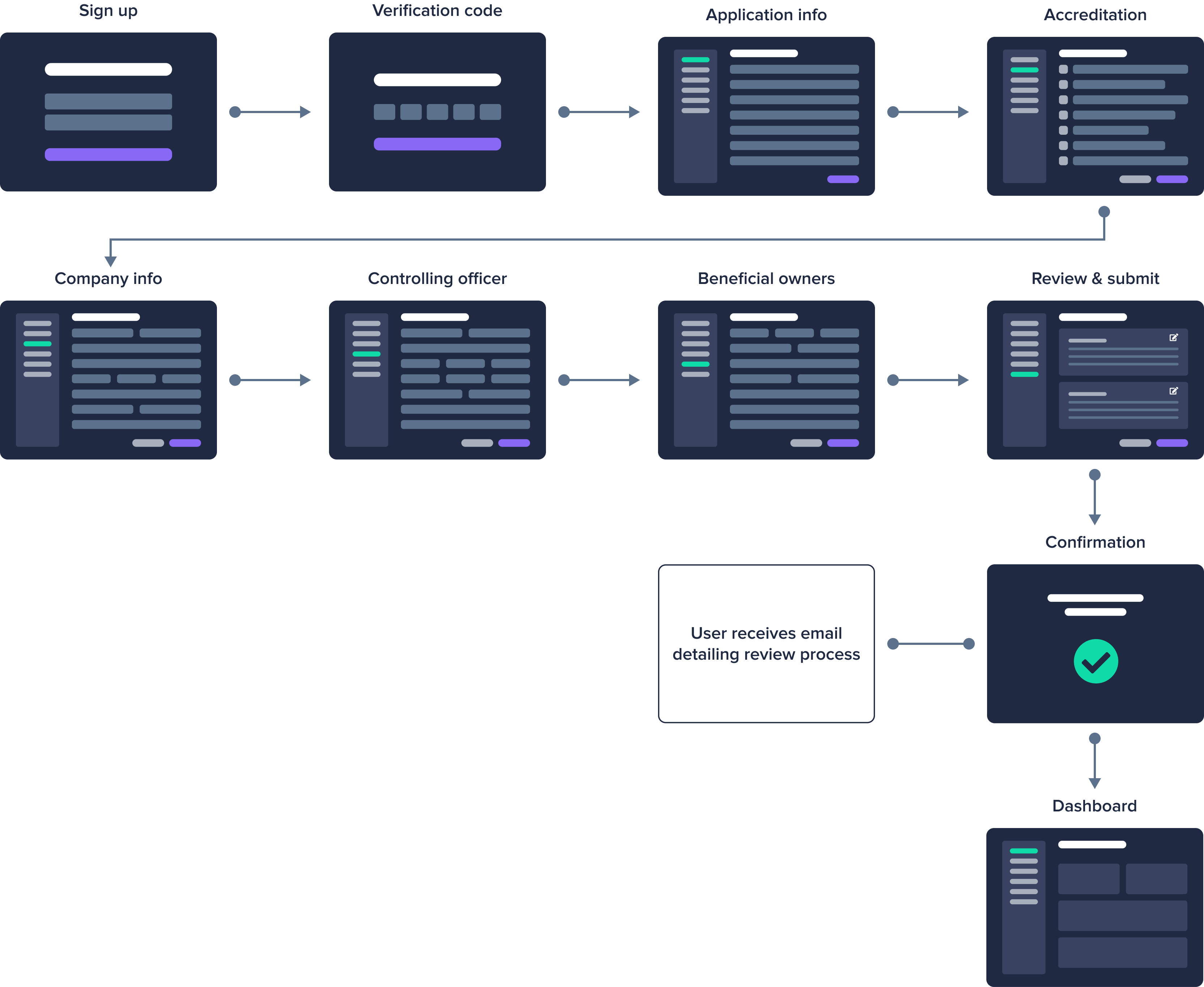
During the design process, I developed several critical user flows, including the onboarding flow shown below. The diagram effectively communicated my strategy to the team, which involved breaking the account creation process into multiple steps with a save feature. Assuring the user they could pause and resume without losing progress, enhancing both clarity and confidence throughout the onboarding experience.

Cvex account creation user flow

Designing a cohesive system

Colors

I transformed CVEX’s minimal blue and white branding into a robust, full-spectrum color palette, specifically designed for a dark-themed interface. This expansion not only enhanced the visual depth and flexibility of the platform but also laid the foundation for future updates across digital and print mediums, ensuring brand consistency and adaptability as the company evolves.

Platform color pallet swatches

Foundational elements

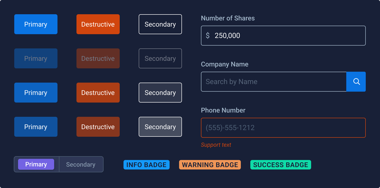
Here is a sample of the comprehensive library of atomic design elements, tailored to the unique needs of the onboarding and trading flows. This included multiple variants of input fields to ensure flexibility and usability across different user interactions. Additionally, I introduced high-contrast pill components to highlight trade statuses and guide users seamlessly through available tasks, enhancing clarity and engagement in critical trading processes.

A grouping of buttons and form elements

Core UI Components

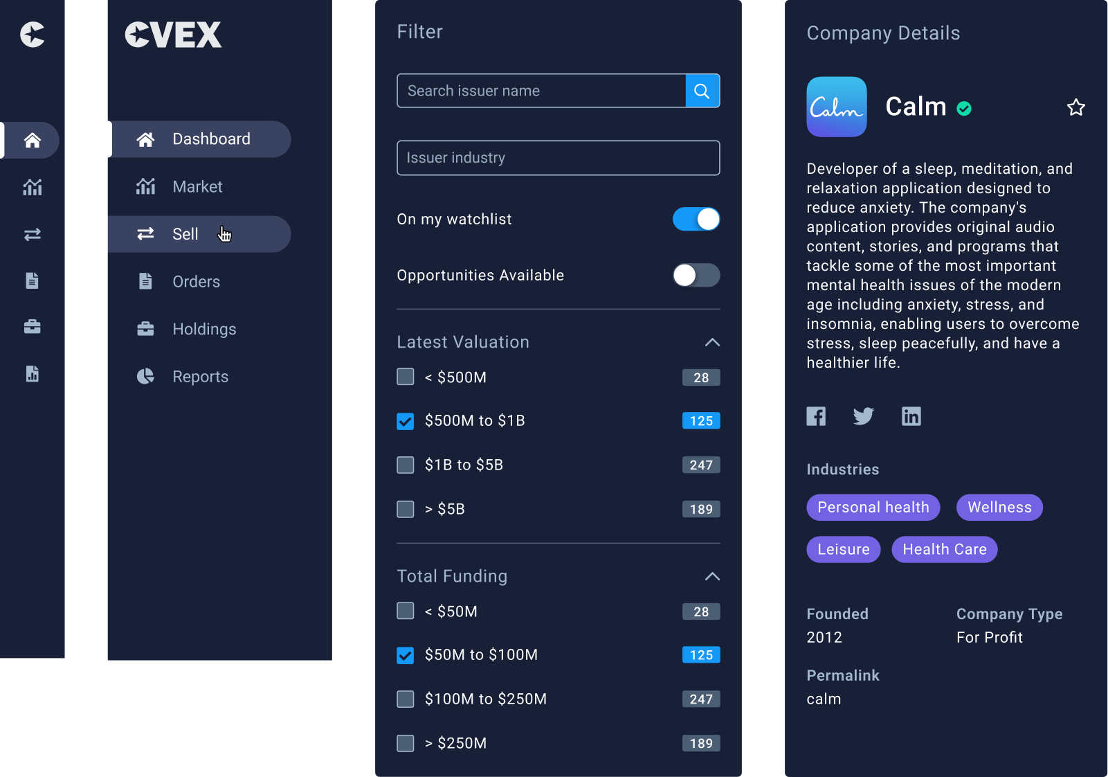
I standardized the essential UI components, including dropdowns, tables, and the primary sidebar navigation. This effort established consistency across the platform, improving usability and ensuring a cohesive user experience. This streamlined the design process, increasing efficiency for the development team.

UI components
Dashboard design
Cvex Dashboard
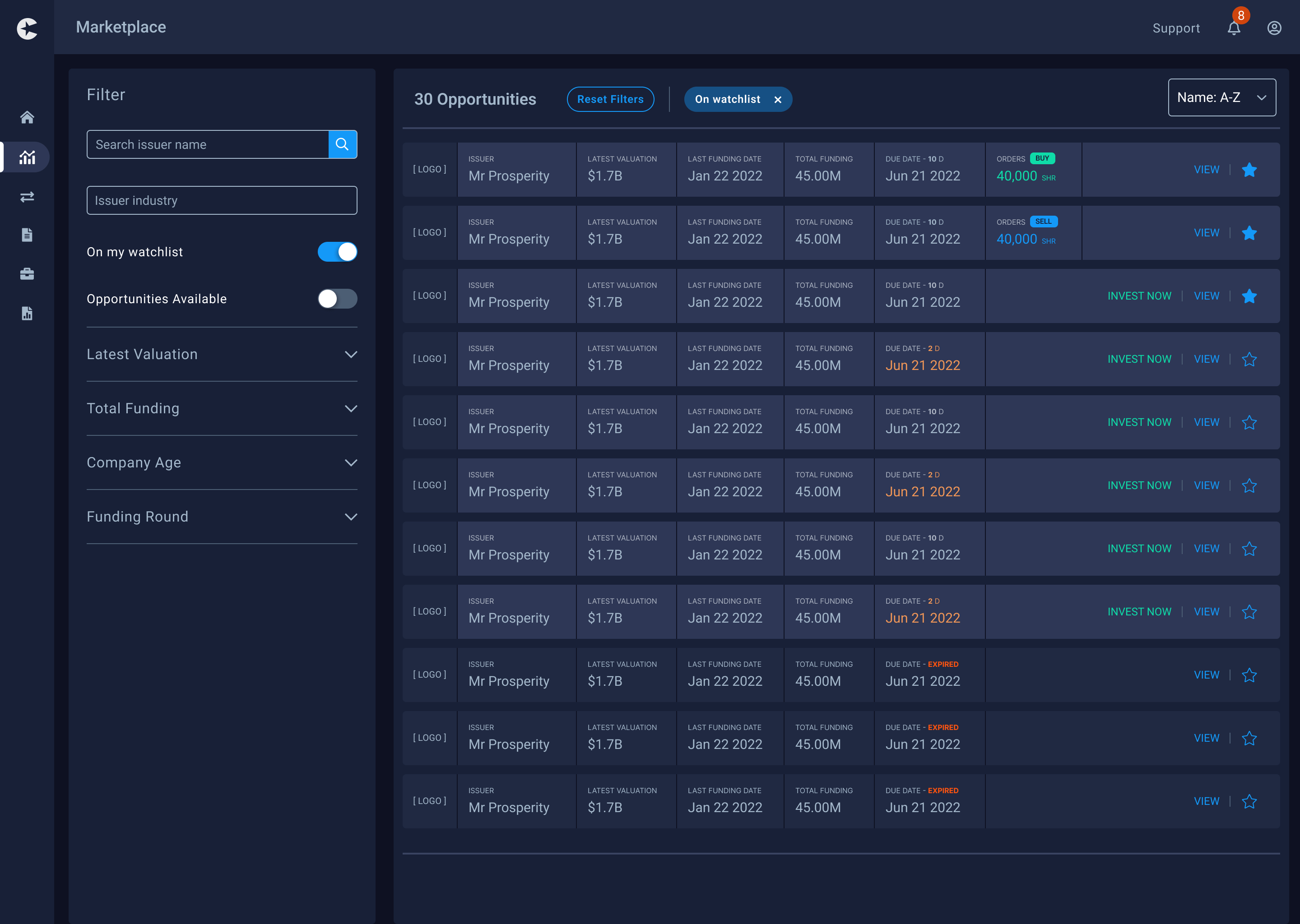
Marketplace design
Cvex Dashboard
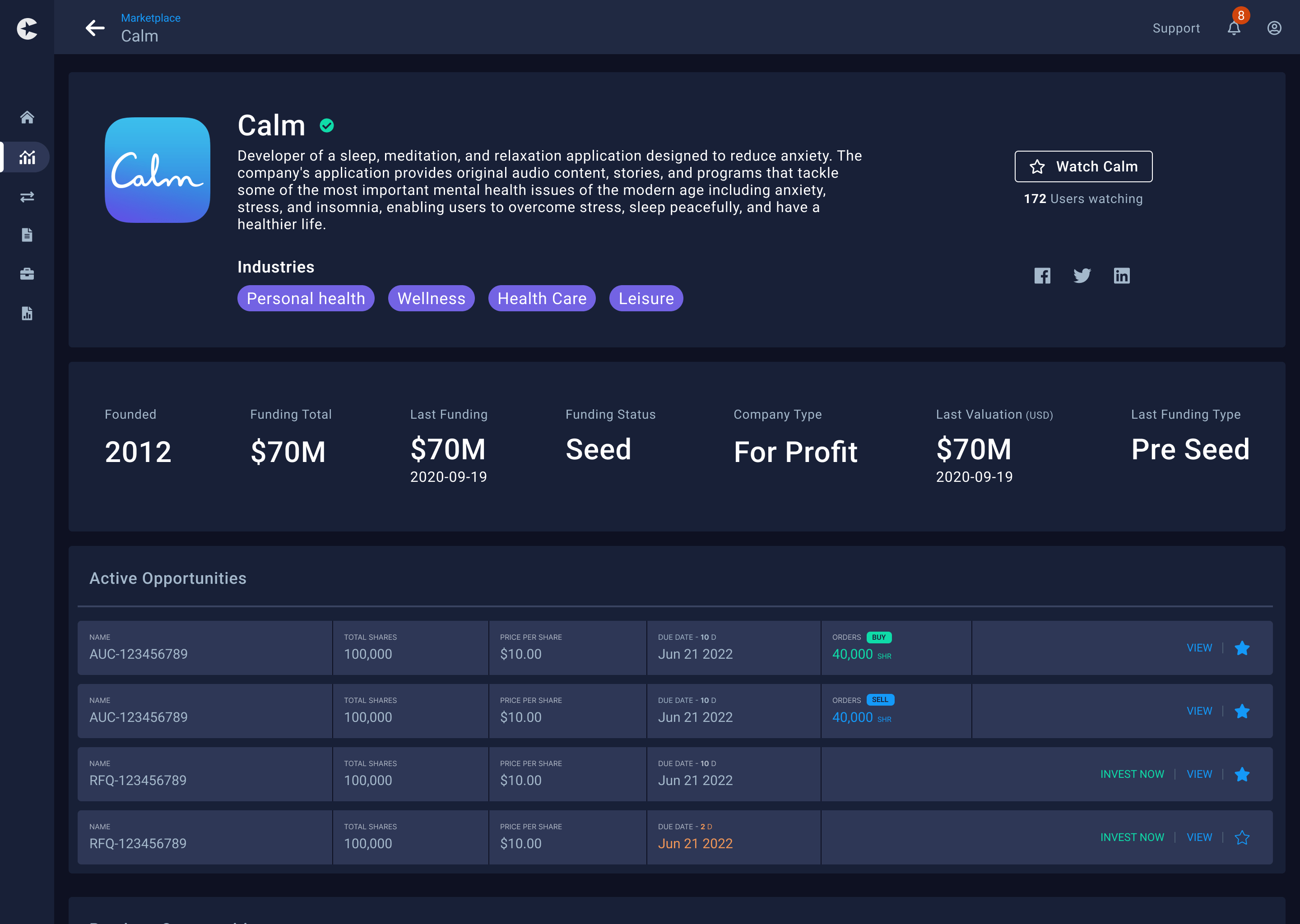
Company details design
Cvex Dashboard

Key learnings

Stars icon
North star

It’s important that the whole organization is driving towards the same goal.

Piggy bank icon
New industry

I discovered a lot about the trading process and financial industry.

Bat icon
Dark theme

Designed (mostly complete) my first dark themed interface learning about the pallet.