
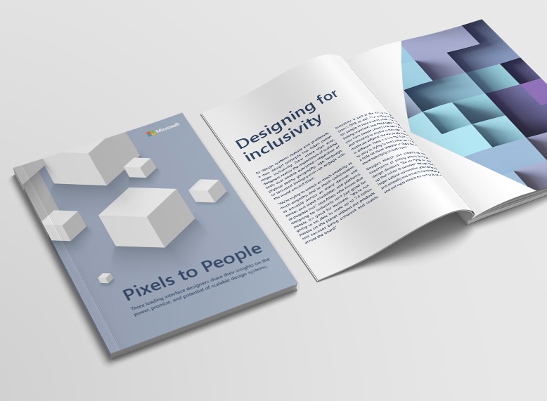
Microsoft held a panel discussion explaining the importance of scalable design systems. Following that discussion I was asked to design a book that captured the essence of the conversation. I created eleven spreads that explained the key points of the panel discussion. I designed the book so that it gave a subtle nod to their design system by using elements like dimensional images to create depth, justified text to represent building blocks and scale to create focus. This document was used as a tool to educate the world about the importance of building a flexible design system.
Art Direction and Design
Microsoft
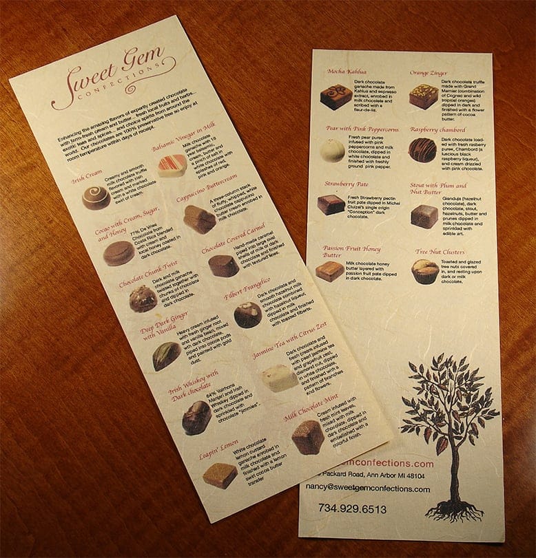
Sweet Gem is well-known for their delicious chocolate, but the company’s product insert struggled to make the individual chocolates clearly identifiable. I took macro photos of the product line and arranged the information in a format that accommodated the variety of boxes the chocolatier used. The warm natural fiber paper that was used for the insert complimented the all-natural chocolates, giving these confections clarity by way of design.
Layout Design and Photography
Sweet Gem Confections
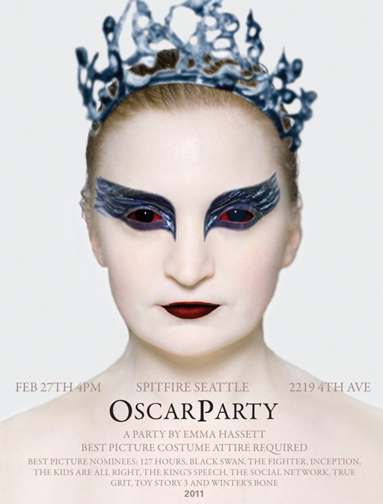
Every year, one of my former clients throws a large Oscar party celebration. Guests arrive dressed in best picture nominee attire, in anticipation for this formal annual suarez. I was commissioned to design the invitation for the Oscar party in 2011. The invitation was meant to mimic an existing best picture movie poster, and we ultimately decided on Black Swan. I used a photo of my client, layering on digital makeup in Photoshop to transform her into the protagonist of Black Swan, Nina Sayers.
Photography, Photoshop Work and Layout Design
Emma Hassett

Having a love for photography, I wanted to explore the process of illustrating a vintage camera. I used this as a personal exercise in form and color.
Illustration
Personal
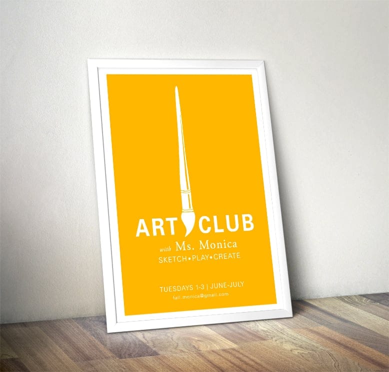
A local artist was in need of a poster to advertise a set of summer art workshops she was teaching. I designed a poster that promoted her classes, and helped fill the remainder of her openings.
Layout Design and Illustration
Monica Gonzalez
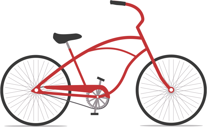
A fun exploration in color and form. Learned how to make some killer bike spokes.
Illustration
Personal